Marriage has long been seen as a major life milestone, but how has that changed over time? With love in the air this Valentine’s Day, I wanted to explore how marital trends look across the United States.
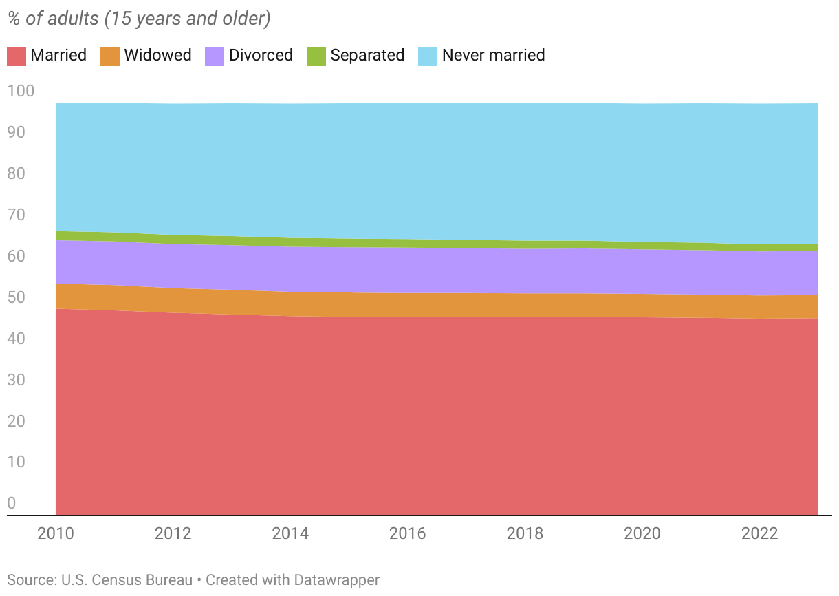
Marital trends from 2010 to 2023
Data from the U.S. Census Bureau shows a 2.3% drop in married individuals and a 3.1% increase in the never-married population in just over a decade. Divorce rates have slightly increased, while the rates of widowed and separated individuals have slightly decreased—though not as dramatically as other categories.
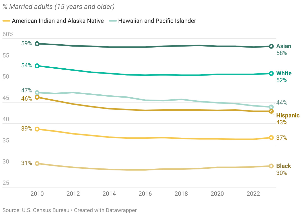
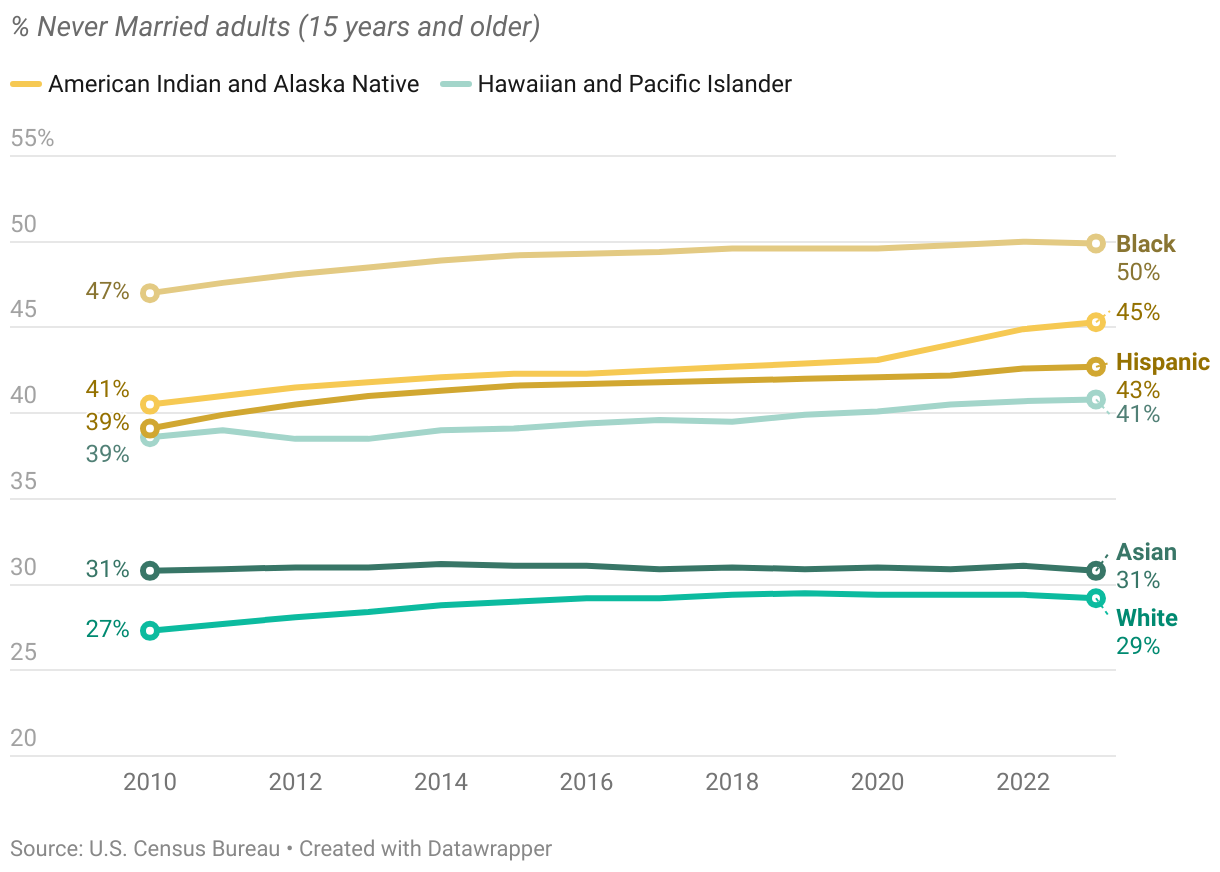
We can also observe this common trend in the married and never-married population across different ethnic groups. Additionally, the data shows that more than 50% of Asians and Whites tend to be married, while Black, Hispanic, and other minority groups have a higher proportion of never-married individuals.
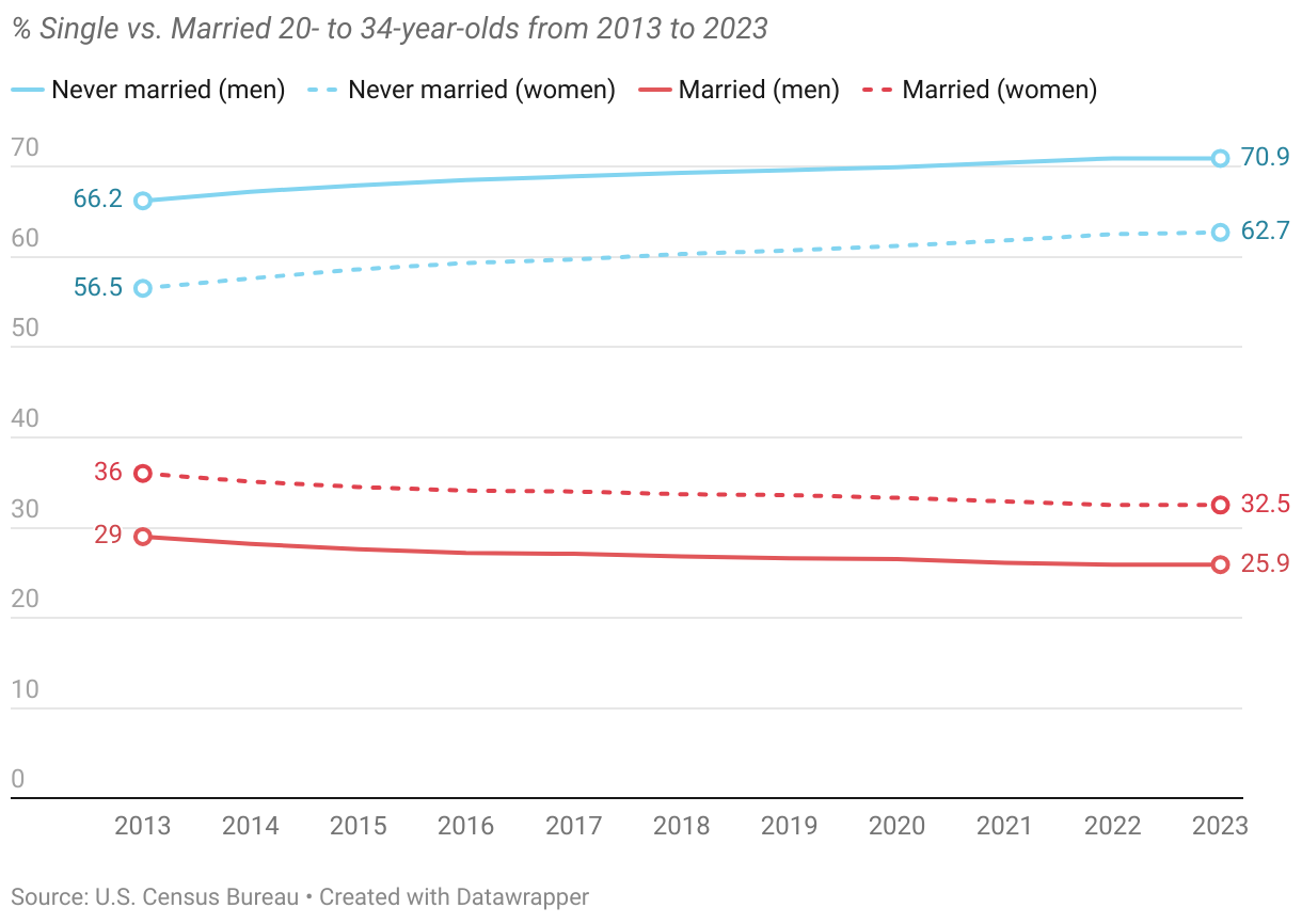
How has the marriage trend among young adults changed? For both men and women, we see a steady decline in young adults getting married and a rise in those remaining never married during their 20s and mid-30s over the past decade.
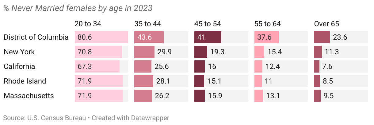
States with the highest never-married population
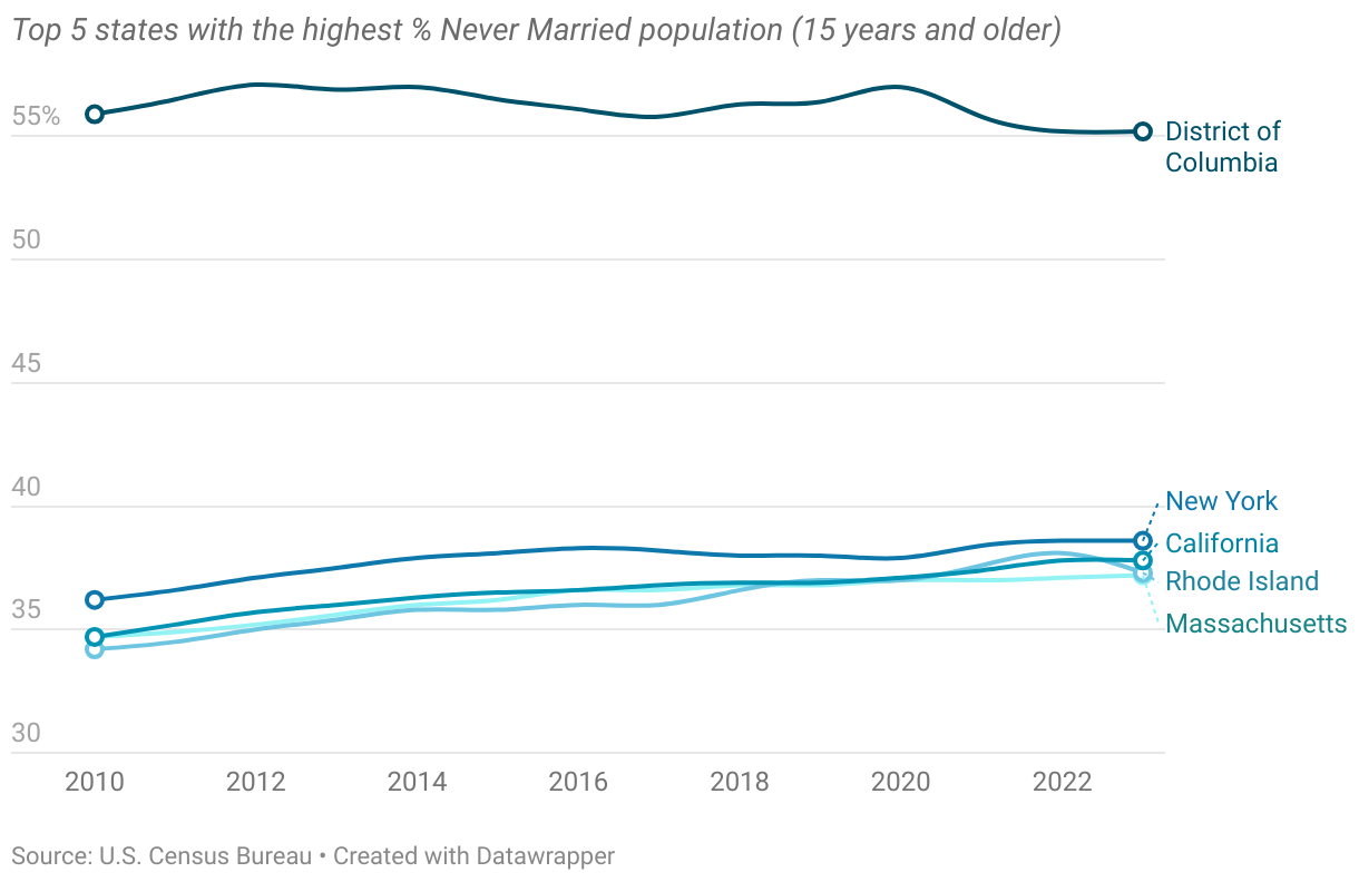
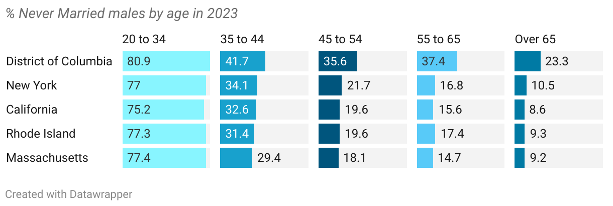
Washington D.C. has the highest percentage of never-married individuals, likely due to its younger, career-focused population. 50.4% of its population is between 15 to 44 years old. In 2023, over 40% of adults aged 35 to 44 in Washington D.C. had never married. Large metropolitan areas (New York, California) also have higher single populations, possibly due to delayed marriage and shifting priorities.
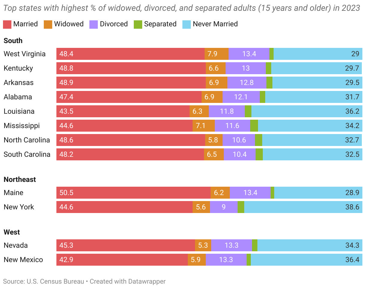
States with the highest widowed, divorced, and separated population
When it comes to love, heartbreak and grief can sometimes follow. Southern states make up most of the top states with the highest widowed, divorced, and separated population.
Explore the data yourself
Using an interactive heart waffle chart and cartogram, these visualizations break down the percentage of each marital status in 2023, state by state. Explore the data yourself to reveal some fascinating patterns—where people are more likely to tie the knot and which states have the highest single populations.
How to Read the Heart Waffle Chart:
It is a 50-square grid in which each square represents 2% of the U.S. population aged 15 and older. The colors indicate different marital statuses. Due to rounding, some states may have one square without any marital status.
Cartogram Map
A cartogram is a type of map that is geometrically distorted in order to convey the information of an alternate variable. In this case, all the US states appear to be the same size in order to more easily visualize the heart waffle charts. On desktop, hover over each state to view more details. To find a specific state on the map, use the dropdown menu at the top.